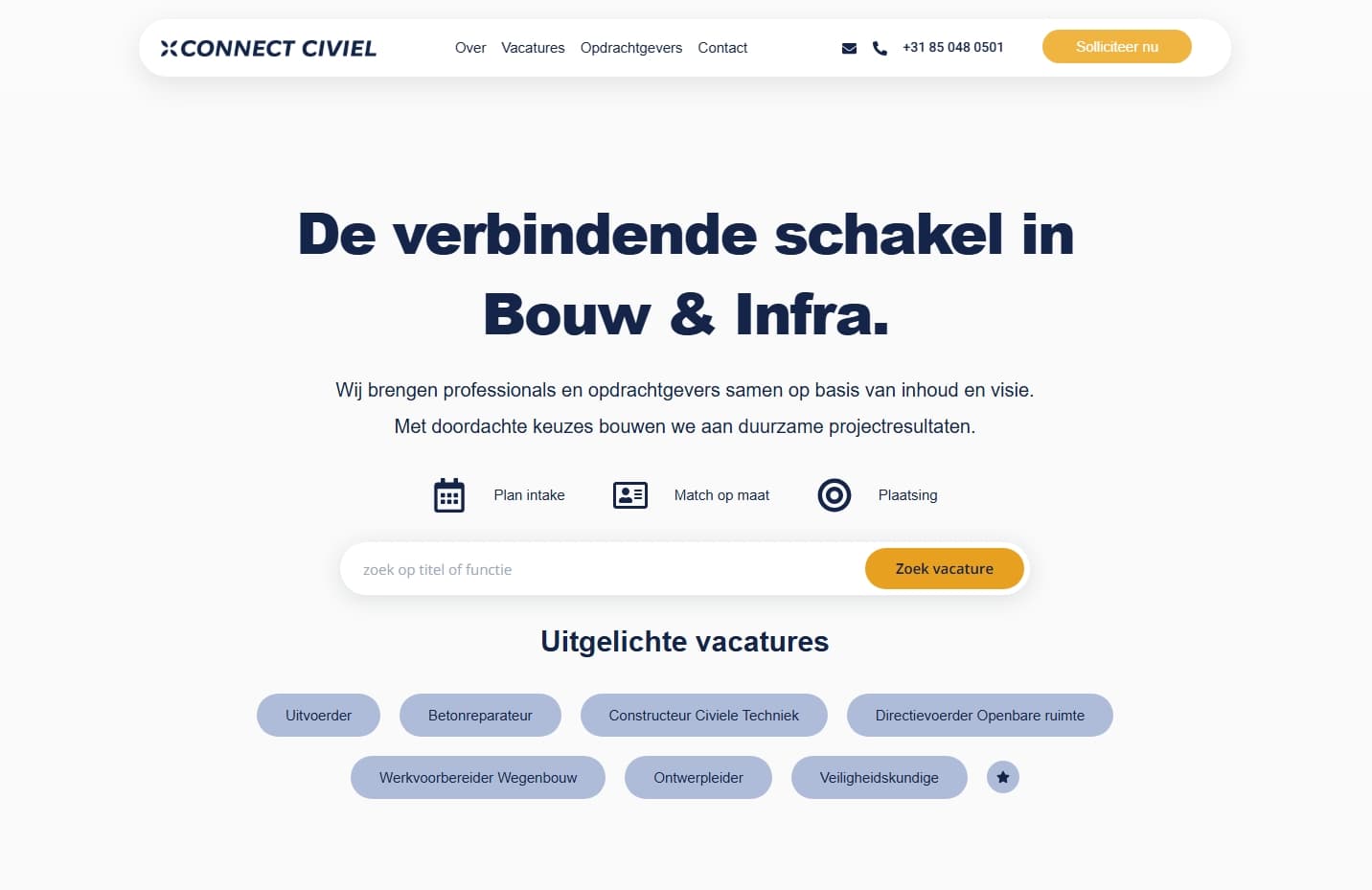
A focused responsive development project for ConnectCiviel, a Dutch civil engineering job board. The work covered a full mobile and tablet responsiveness pass across the entire site — including header, footer, homepage, job archive, single job templates, and the employer page — with structural fixes and custom CSS where needed.
ConnectCiviel — Full Mobile & Tablet Responsive Development
Overview
ConnectCiviel is a Dutch job board platform specializing in civil engineering recruitment, connecting employers with qualified candidates in the civiel sector. The project was scoped as a focused responsive development engagement — making the entire website fully functional and visually consistent across mobile and tablet devices.
The Challenge
The existing site was built without adequate attention to responsive behavior, resulting in broken layouts, poor spacing, and unusable interfaces on smaller screens. Key issues included:
- Header and footer elements breaking or overflowing on mobile and tablet viewpoints
- Homepage sections with poor structural choices that required layout changes — not just CSS tweaks — to work responsively
- A job archive page powered by a shortcode that needed custom CSS to behave responsively within the WordPress environment
- Single job templates with two card variants (blue and yellow) that each required individual responsive treatment
- An employer-facing page with spacing and layout issues across all sections
Scope of Work
Header & Footer
Both the header and footer were made fully responsive, ensuring navigation, branding elements, and footer content displayed correctly across all screen sizes.
Homepage
The homepage required the most structural intervention. Several sections had fundamentally poor markup and layout structure that couldn't be fixed with spacing adjustments alone — section structures were changed where necessary, spacing was corrected throughout, and every element across all sections was made responsive for mobile and tablet.
Job Archive Page
The job archive page was made fully responsive. The listings were rendered via a shortcode, which required writing custom CSS to override default shortcode output and ensure the listing grid and filters displayed correctly on smaller screens.
Single Job Template
The single job detail template was made responsive, including both card template variants — the blue card and the yellow card — each adjusted individually to display correctly across breakpoints.
Employer Page
The employer-facing page was reviewed section by section — spacing was corrected and every element was made responsive for mobile and tablet views.
Key Features
- Full Site Responsive Pass — Every key page and template covered in a single focused session
- Structural Fixes — Section structures rebuilt on the homepage where layout issues couldn't be resolved with CSS alone
- Custom CSS for Shortcodes — Targeted CSS written to make third-party shortcode output responsive
- Dual Card Template Responsiveness — Both blue and yellow job card variants individually handled
- Mobile & Tablet Coverage — All fixes tested and verified across both breakpoint ranges
Result
A fully responsive ConnectCiviel website across mobile and tablet — with structural fixes on the homepage, custom CSS for shortcode-rendered content, and responsive treatment across the header, footer, job archive, single job templates, and employer page, all delivered in a single development session.