How to Optimize Remote WordPress Images in Next.js
Images are usually the heaviest part of any page. In a headless WordPress setup, the Next.js Image component can automatically resize, convert, and lazy-load your remote WordPress media — but only once it's configured correctly. Here's how to set it up for fast, responsive project galleries.
Why Image Optimization Matters
On most websites, images account for the majority of page weight. An unoptimized WordPress media library serving full-resolution JPEGs can push pages into multiple megabytes — destroying load times, hurting Core Web Vitals, and frustrating mobile visitors on slower connections.
Next.js includes a powerful Image component that solves this automatically: it resizes images to the exact dimensions needed, converts them to modern formats like WebP and AVIF, serves responsive sizes per device, and lazy-loads anything below the fold. The catch in a headless setup is that your images live on a remote WordPress domain — and Next.js blocks remote images until you explicitly allow them.
This guide configures the full pipeline for optimizing remote WordPress media in a headless Next.js front-end.
The Remote Image Problem
For security, Next.js refuses to optimize images from arbitrary external domains by default. If you drop a remote WordPress image URL into the Image component without configuration, you'll hit this error:
Error: Invalid src prop (https://cms.yoursite.com/wp-content/uploads/project.jpg)
on `next/image`, hostname "cms.yoursite.com" is not configured under images in your next.config.js
This is intentional. Next.js wants you to explicitly whitelist which domains are allowed to serve images through its optimization pipeline — preventing your server from being used to proxy and optimize images from any domain on the internet.
Configuring Remote Patterns
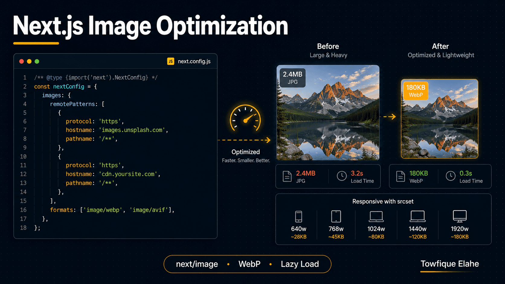
The fix is the images.remotePatterns setting in next.config.js. This whitelists your WordPress domain so Next.js will optimize images from it:
// next.config.js
/** @type {import('next').NextConfig} */
const nextConfig = {
    images: {
        remotePatterns: [
            {
                protocol: 'https',
                hostname: 'cms.yoursite.com',
                port: '',
                pathname: '/wp-content/uploads/**',
            },
        ],
    },
};

module.exports = nextConfig;
Breaking down each field:
protocol— restrict tohttpsfor security in production.hostname— your WordPress domain. This is the exact host serving your media.port— leave empty for standard ports.pathname— scope it to/wp-content/uploads/**so only the media library is allowed, not arbitrary paths on the domain.
Scoping the pathname to the uploads directory is a good security habit — it means only genuine media files can pass through the optimizer, not any URL on your WordPress host.
Important: changes to next.config.js require a restart of the dev server to take effect.
Using the Image Component
With the domain whitelisted, the Image component works with remote WordPress URLs. The key requirement is that Next.js must know the image dimensions ahead of time — either explicit width and height, or the fill mode:
import Image from 'next/image';

export default function ProjectCard( { project } ) {
    return (
        <article className="project-card">
            <Image
                src={project.thumbnail}
                alt={project.title}
                width={800}
                height={600}
                className="project-image"
            />
            <h2>{project.title}</h2>
        </article>
    );
}
The width and height here define the aspect ratio and prevent layout shift — they don't force the display size. CSS still controls how the image actually renders. Providing them lets Next.js reserve the correct space before the image loads, which directly improves your Cumulative Layout Shift (CLS) score.
Handling Unknown Dimensions with Fill
WordPress media comes in all shapes, and you don't always know the exact dimensions ahead of time. The fill prop makes the image expand to fill its parent container instead of requiring fixed dimensions:
<div className="image-wrapper" style={ { position: 'relative', aspectRatio: '4 / 3' } }>
    <Image
        src={project.thumbnail}
        alt={project.title}
        fill
        style={ { objectFit: 'cover' } }
        sizes="(max-width: 768px) 100vw, 33vw"
    />
</div>
Two requirements when using fill:
- The parent element must have
position: relative(and a defined height or aspect ratio). - You should provide the
sizesprop so Next.js can pick the right resolution — more on this next.
Responsive Sizing with the sizes Prop
The sizes prop is the single most important and most overlooked part of image optimization. It tells Next.js how much screen width the image will occupy at different breakpoints, so it can serve an appropriately sized file instead of the largest one.
<Image
    src={project.thumbnail}
    alt={project.title}
    fill
    sizes="(max-width: 640px) 100vw,
           (max-width: 1024px) 50vw,
           33vw"
/>
This reads as: on screens up to 640px the image spans the full viewport width; up to 1024px it takes half; on larger screens it occupies a third (a three-column grid). Next.js uses this to generate a srcset and serve the smallest file that still looks sharp.
Without sizes, Next.js assumes the image could be full-width on every device and serves unnecessarily large files to phones — wasting the entire benefit of optimization. For any grid or multi-column layout, always set sizes accurately.
Enabling Modern Formats
Next.js can automatically serve WebP and AVIF — formats that are dramatically smaller than JPEG at equivalent quality. Enable them in the config:
// next.config.js
images: {
    formats: [ 'image/avif', 'image/webp' ],
    remotePatterns: [
        // ... your patterns
    ],
},
With this set, Next.js checks what the visitor's browser supports and serves AVIF first (smallest), falling back to WebP, then the original format. A 2.4MB source JPEG can often become a 180KB WebP — a 90%+ reduction — with no visible quality loss. The original WordPress file stays untouched; the optimized version is generated and cached on demand.
Lazy Loading and Priority
By default, the Image component lazy-loads every image — they only download as they approach the viewport. This is ideal for a long project gallery, where below-the-fold images shouldn't compete for bandwidth on initial load.
The exception is your above-the-fold hero image — the Largest Contentful Paint (LCP) element. For that one image, lazy loading actually hurts, because it delays the most important visual. Mark it with priority to load it eagerly:
<Image
    src={heroImage}
    alt="Featured project"
    width={1200}
    height={630}
    priority
/>
The rule of thumb: priority on the single most important above-the-fold image, lazy loading (the default) on everything else. Don't add priority to multiple images — it defeats the purpose and slows initial load.
Adding Blur Placeholders
A blurred placeholder shown while the full image loads makes the experience feel polished and reduces perceived load time. For remote images where you can't generate a static blur at build time, use a lightweight inline data-URL placeholder:
<Image
    src={project.thumbnail}
    alt={project.title}
    width={800}
    height={600}
    placeholder="blur"
    blurDataURL="data:image/svg+xml;base64,..."
/>
For a headless setup, a practical approach is to have WordPress generate a tiny base64 thumbnail and include it in your REST API response — then pass it straight into blurDataURL. The placeholder shows instantly while the optimized image streams in behind it.
Building a Responsive Project Gallery
Putting it together — a complete optimized gallery component for headless WordPress project images:
import Image from 'next/image';

export default function ProjectGallery( { images } ) {
    return (
        <div className="gallery-grid">
            {images.map( ( image, index ) => (
                <div key={image.id} className="gallery-item">
                    <Image
                        src={image.url}
                        alt={image.alt || 'Project image'}
                        fill
                        sizes="(max-width: 640px) 100vw,
                               (max-width: 1024px) 50vw,
                               33vw"
                        style={ { objectFit: 'cover' } }
                        priority={index === 0}
                    />
                </div>
            ) )}
        </div>
    );
}
/* The CSS that makes fill mode work */
.gallery-grid {
    display: grid;
    grid-template-columns: repeat( auto-fill, minmax( 280px, 1fr ) );
    gap: 1rem;
}

.gallery-item {
    position: relative;
    aspect-ratio: 4 / 3;
    overflow: hidden;
    border-radius: 8px;
}
Note priority={index === 0} — only the first image loads eagerly as the likely LCP element; the rest lazy-load as the visitor scrolls.
Handling Broken or Missing Images
WordPress media can be deleted or moved, leaving broken URLs. Handle this gracefully with a fallback using the onError handler in a client component:
'use client';
import Image from 'next/image';
import { useState } from 'react';

export default function SafeImage( { src, alt, ...props } ) {
    const [ imgSrc, setImgSrc ] = useState( src );

    return (
        <Image
            {...props}
            src={imgSrc}
            alt={alt}
            onError={() => setImgSrc( '/images/placeholder.jpg' )}
        />
    );
}
If the remote WordPress image fails to load, it swaps to a local placeholder instead of showing a broken image icon.
Caching and the Optimization Pipeline
Next.js optimizes each image once, on first request, then caches the result. Subsequent visitors get the cached optimized version served from the Next.js cache (or your CDN edge if deployed on a platform like Vercel). The original WordPress file is fetched only once per size variant.
This means the optimization cost is paid a single time per unique image-size combination. On a CDN-backed deployment, optimized images are served from edge locations close to each visitor — combining WordPress's content management with edge-delivered, format-optimized media.
Best Practices
- Always scope
remotePatternsto the uploads path, not the whole domain. - Always provide accurate
sizesfor any image that isn't full-width — it's the difference between real optimization and serving oversized files. - Use
priorityon exactly one above-the-fold image (the LCP element), never on a whole gallery. - Enable AVIF and WebP in the config for the biggest file-size wins.
- Always set
width/heightor usefillwith a sized container to prevent layout shift. - Include a blur placeholder from a tiny base64 thumbnail in your API response for a polished loading experience.
- Handle broken remote images with an
onErrorfallback.
Final Thoughts
Image optimization is where a headless Next.js front-end pulls decisively ahead of traditional WordPress theming. With remotePatterns configured and the Image component used properly — accurate sizes, modern formats, smart lazy loading, and blur placeholders — your WordPress media gets automatically resized, converted, and edge-delivered, often cutting image weight by 80–90%.
The result is fast-loading project galleries with strong Core Web Vitals, powered by content that editors still manage comfortably in WordPress. It's the headless promise fully realized: editor-friendly back end, performance-optimized front end.
In the next post, we'll handle the other half of media in headless WordPress — building a file upload component in Next.js that sends images to Supabase Storage, giving your front-end its own media pipeline alongside the WordPress library.